
Data Visualization YouTube channel analysis
Data Visualization is a YouTube channel with 13.3K subscribers and 21.7M total views, and an estimated $23 – $75/mo revenue. This analysis breaks down its outlier videos, content strategy, similar channels, revenue & valuation estimate.
Analysis generated with AI from public YouTube data. Revenue and valuation figures are estimates derived from public data, not financial advice.
Data Visualization Channel Overview
lifetime totalsData Visualization Outlier Videos
breakouts ≥1.5× recent median






Data Visualization Top Videos
biggest ever

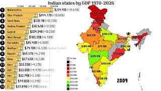

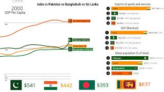
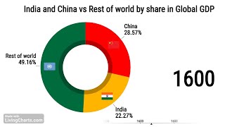


REPLICATE: This channel is a prime candidate for replication due to its highly systematic, low-cost, faceless production model. It leverages open-source data and automated visualization tools to generate consistent views, though scaling requires leaning heavily into regional pride and geopolitical rivalries to trigger comment-section engagement.
Data Visualization Niche & Positioning
Faceless bar-chart races and data comparisons pitting global regions, countries, and sub-national states against each other across economic, demographic, and development metrics.
Data Visualization Content Strategy
Timeless, highly searchable historical and projected data comparisons (ranging from 1900 to 2040) packaged as dynamic bar-chart races that capture ongoing regional curiosity.
Data Visualization Outlier Playbook
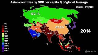
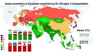
the repeatable breakout formulaMake animated country-ranking comparisons that frame Asia vs Europe as a direct rivalry on simple human-development/demographic metrics where viewers expect a dramatic gap or catch-up: infant mortality, literacy rate, life expectancy, internet penetration, extreme poverty, fertility/children share, GDP per capita vs global average. The breakout pattern is not narrow province/state GDP videos; it is broad continental comparison with many recognizable countries, a long time span ending in 2025/2026, and a clear moral/status hook like “who is healthier, richer, more educated, more connected, or poorer?” No guests. Best timing is updated/current datasets with 2025/2026 projections, sometimes 203
“Asian countries vs European countries by [high-interest welfare/demographic metric] | Asia vs Europe” or “European and Asian Countries by [metric] | Asia and Europe comparison [start year]-2025”. Strongest exact hooks from the channel: “Infant mortility rate”, “literacy rate”, “Life expectancy”, “I
- 1Build the next videos around the proven Asia-vs-Europe welfare ladder: “Asian countries vs European countries by maternal mortality 1960-2025”, “Asian countries vs European countries by access to clea
- 2Use the same bar-chart-race format as the winners: all Asian and European countries together, flags visible, continent labels/colors, yearly movement from historical baseline to 2025/2026, and a final
- 3Title it with the exact proven syntax, putting the continent rivalry and metric first: “Asian countries vs European countries by [metric] | Asia vs Europe”. Add the date range only after the main hook
- 4Prioritize metrics with emotional contrast over abstract economics. The channel’s biggest outliers were infant mortality, literacy, life expectancy, internet penetration, poverty, children share/ferti
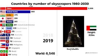
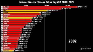
- 5Every 4-6 uploads, add one secondary breakout-style status race using the proven non-Asia-Europe patterns: “Countries with the Most Skyscrapers, 1980-2030 UPDATED” or “Chinese cities vs Indian cities
Data Visualization Performance Drivers
Data Visualization Topic Clusters
Data Visualization Growth Opportunities
untapped whitespace- Introduce voiceover narration or synthesized AI commentary to explain the historical context behind sudden data shifts, increasing viewer retention.
- Expand into short-form content (YouTube Shorts) by clipping the most dramatic transition moments of the bar-chart races to capture viral feed traffic.
- Target the US vs. China geopolitical rivalry more explicitly with dedicated technology, military, and economic comparison series.
- Create community polls and interactive community tab posts asking viewers to predict the winner of upcoming data comparisons to boost channel engagement metrics.
How Replicable Is Data Visualization
The content relies entirely on publicly available databases (World Bank, IMF) and standardized bar-chart race software, requiring zero on-camera talent or complex filming setups.
Data Visualization Content Risks
- High vulnerability to copycat channels due to the low barrier to entry for producing automated bar-chart race videos.
- Extreme reliance on regional/nationalistic comment wars to drive algorithmic reach, which can lead to toxic comment sections and potential moderation issues.
- Potential viewer fatigue from repetitive visual formats and identical audio tracks across hundreds of short data-comparison videos.
Who Watches Data Visualization
estimated audienceEstimated from public channel data — titles, descriptions, metadata and co-watched channels. Not YouTube Analytics. high confidence
This audience consists of highly analytical geography and economics enthusiasts, heavily concentrated in India and South Asia, who consume data-driven visual content to understand regional development, geopolitical shifts, and macroeconomic trends. They are often students, competitive exam aspirants, or young professionals who value objective, comparative statistics over narrative-heavy commentary.
Highly male-dominated
Concentrated in South Asia with a secondary global audience of geography and statistics enthusiasts.
What Data Visualization's Audience Cares About
- Sifting through dry, unformatted academic papers to find clear regional trends
- Nationalistic bias in mainstream media reporting of economic metrics
- Lack of easily digestible, localized data comparisons for South Asian regions
- To prepare for academic or competitive civil service examinations
- To engage in online geopolitical debates with factual, data-backed evidence
- To satisfy a curiosity for comparative statistics and global rankings
Intellectually curious digital natives who spend their free time browsing educational forums, map subreddits, and informational YouTube channels.
- Indian States vs. Chinese Provinces: GDP and HDI Projections to 2035
- Why South Asia's Demographic Dividend is Shifting: Fertility Rates Compared
- The Rise of Megacities: Comparing Skyscrapers and Infrastructure in East Asia vs. North America
- European Union vs. US States: A Regional GDP per Capita Comparison
- Global Military Spending and Defense Budgets: Asia vs. NATO
Prefers Short-form to medium-length high-density videos (2 to 4 minu videos, objective, analytical, comparative, and neutral.
Inferred from: Frequent comparison videos of Indian states, South Asian countries, and Chinese provinces · Co-watch channels focused on geography, mapping, and regional statistics (Geography By Geoff, Map Men) · High density of macroeconomic and demographic metrics in video titles (GDP, HDI, fertility rates, urbanization)
The audience is highly concentrated around comparative country statistics, maps, and regional geopolitics, with minor spillover into regional news and travel vlogs.


Track your whole niche in Competitor Studio
These are just the closest channels. Competitor Studio maps 1,000+ direct & adjacent channels in your niche — with outlier detection and ongoing tracking.
- Track 1,000+ direct & adjacent competitors
- Outlier video detection
- AI-powered video insights

Data Visualization Revenue & Valuation
from public dataBased on your current performance, we estimate your channel's valuation at $312 to $1,597, with a firm floor of $241 and a high confidence rating. Please note that any future valuation expansion is strictly illustrative and depends entirely on your successful execution of key growth levers.
Estimates derived from public data (earnings history + comparable channels). Not an offer, appraisal, or financial advice.
Frequently asked questions about Data Visualization
- How many subscribers does Data Visualization have?
- Data Visualization has 13.3K subscribers on YouTube, built up over roughly 2 years on the platform. Its videos average about 25.9K views each.
- How many views does Data Visualization have?
- Data Visualization has accumulated 21.7M total views across 840 uploads, averaging roughly 29.1K views per day since launch.
- How many videos has Data Visualization posted?
- Data Visualization has published 840 videos on YouTube, with recent uploads averaging about 2:40 in length.
- How engaged is Data Visualization's audience?
- Over its lifetime, Data Visualization has averaged about 1633 views for every subscriber, a sign of how far its videos travel beyond the core subscriber base. On a per-video basis it draws roughly 25.9K views.
- How much money does Data Visualization make?
- Data Visualization's estimated YouTube revenue is $23 – $75 per month, including advertising and sponsorships (ad revenue alone is an estimated $18 – $25 per month). These are estimates derived from public data, not exact earnings.
- What is Data Visualization's channel worth?
- Data Visualization's YouTube channel is estimated to be worth $312 – $2K, benchmarked against comparable channels. This reflects the value of the channel as a media asset, not the creator's total net worth.
- What is Data Visualization's most popular video?
- Data Visualization's most-viewed video is "Tamil Nadu vs Pakistan by GDP 1995-2025 Pakistan Tamil Nadu by GDP #tamilnadu #pakistan #economy", with 148.0K views — roughly 47.7× the channel's typical video.
- What is Data Visualization's biggest recent breakout video?
- Data Visualization's biggest recent breakout is "Asian countries vs European countries by Infant mortility rate | Asia vs Europe", which pulled 55.0K views — about 17.7× the channel's recent median.
- What kind of content does Data Visualization make?
- Data Visualization is best described as Geopolitical & Demographic Data Animations. Faceless bar-chart races and data comparisons pitting global regions, countries, and sub-national states against each other across economic, demographic, and development metrics.
- Does Data Visualization post Shorts or long-form videos?
- Data Visualization publishes primarily long-form videos (about 100% of recent uploads), averaging around 2:40 in length.
- What topics does Data Visualization cover?
- Data Visualization's catalogue spans Asia vs. Europe Regional Comparisons, India vs. China & South Asian Economic Metrics, Demographics & Quality of Life (Fertility, Mortality, Literacy), Global GDP & Economic Projections and Infrastructure & Energy (Skyscrapers, Solar, Electricity). These recurring themes make up the bulk of the channel's uploads.
- Who watches Data Visualization?
- Data Visualization's audience skews 18-24, highly male-dominated and based concentrated in south asia with a secondary global audience of geography and statistics enthusiasts.. This audience consists of highly analytical geography and economics enthusiasts, heavily concentrated in India and South Asia, who consume data-driven visual content to understand regional development, geopolitical shifts, and macroeconomic trends. They are often students, competitive exam aspirants, or young professionals who value objective, comparative statistics over narrative-heavy commentary. These are estimates inferred from public channel data, not YouTube Analytics.
- What is Data Visualization's audience interested in?
- Viewers of Data Visualization tend to be interested in Geopolitical data and regional comparisons, Macroeconomics and global GDP trends, Demographics, population dynamics, and human development indexes, Urban planning and infrastructure development and Data visualization and animated charts. Estimated from the channel's content and the channels its viewers co-watch.
- What channels are similar to Data Visualization?
- Channels with audiences similar to Data Visualization include Global Stats, InfoZoom, Imperial Statistics, Data Penguin and Nation Sweep. The audience is highly concentrated around comparative country statistics, maps, and regional geopolitics, with minor spillover into regional news and travel vlogs.
- How often does Data Visualization post?
- Data Visualization uploads about 4.6 videos per week (roughly 19.6 per month).
- Is Data Visualization still active on YouTube?
- Yes — Data Visualization is actively posting. Its most recent upload was 1 day ago.
- How long has Data Visualization been on YouTube?
- Data Visualization has been active on YouTube for about 2 years, growing to 13.3K subscribers over that time.
How this analysis was made
- Source: public YouTube channel & video data (120 recent videos sampled).
- Outlier videos: uploads with ≥1.5× the channel's recent median views.
- Revenue & valuation: estimated from public earnings signals and comparable channels — ranges, not exact figures.
- Last updated: 9/24/2026.